Designing for FedRAMP
Most of FedRAMP reads like a security controls list, but a surprising amount of it lands on screen: login banners, timeouts, permission walls, error messages. That part is design work.

Security controls are experienced as interface
The controls FedRAMP verifies are written for security engineers, and it is easy to assume they have nothing to do with design. But no user ever experiences “session lock after inactivity.” They experience being thrown out of a half-finished form and losing their work. No one experiences “access enforcement.” They experience a button that does nothing, with no explanation of why.
Every control with a person in the loop is, in the end, an interaction that someone designed, or failed to design. Handled as a security afterthought, these moments produce the software people resent: the abrupt logout, the cryptic error, the greyed-out control that never says why. Handled as design problems, they become the difference between a secure product people tolerate and one they trust. And because these are exactly the moments where accessibility most often breaks, designing them well does double duty.
The design surface of FedRAMP
These are the control areas that reliably become screens. The identifiers security reviewers use are the NIST 800-53 controls the FedRAMP baselines draw on, useful to quote so a designer and a security reviewer can be certain they are talking about the same thing.
System use notification
Federal systems present an approved use-notification banner that the user acknowledges before proceeding.
The design job is to make a mandatory legal interruption feel deliberate rather than broken:
- a proper dialog with a clear acknowledgment
- focus placed on it when it opens, and returned when it closes
- readable at 200% zoom
- never a keyboard trap

Authentication and multi-factor
Federal work expects strong, increasingly phishing-resistant multi-factor authentication.
The design risk is that many MFA patterns quietly exclude people: tiny countdown timers, codes to transcribe from another device, image puzzles. Instead:
- design for methods that lean on possession rather than memory or dexterity (passkeys, security keys)
- allow pasting a code
- give generous, extendable timing

Session lock and termination
An inactive session must lock, and sessions must end. The inactivity window is often around 15 minutes.
This is the single most important design moment on the page, because a naive implementation (silent logout, work discarded) is both hostile and an accessibility failure. Design a warning that:
- arrives before the lock
- is announced to assistive technology
- lets the user extend the session
- preserves in-progress work
More on this in the overlap section below.

Roles, permissions and least privilege
Users should see and reach only what their role allows.
The design decision is subtle: hide a capability, or show it disabled with an explanation? Hiding keeps interfaces clean but can leave people confused about why a documented feature is missing; disabling is more honest but risks clutter.
Set a clear house rule per pattern, and always answer the question the user is actually asking: not “access denied” but “this needs the Approver role; here is who to ask.”

Error, status and security messaging
Errors must not leak sensitive internals: no stack traces, no “user exists” hints, no server detail. But an error still has to help the person recover.
The craft is writing messages that are specific about the user’s action and completely silent about the system’s plumbing. This is a content-design problem as much as an engineering one, and it should not be left to framework defaults.

The audit trail as a designed surface
Comprehensive logging is required, but logs are only useful if someone can read them.
Administrators, agency security teams, and our own responders all need to search, filter, and export the audit trail under pressure. Treat the log viewer as a real product surface with its own information design, not a raw table dumped behind an admin tab.

Account lifecycle states
Accounts are created, disabled, and removed on a schedule. Each state needs a designed screen:
- what a newly provisioned user sees
- what a disabled user is told
- how an administrator confirms a de-provisioning without doing it by accident
The disabled and de-provisioned states are the ones teams forget, and the ones auditors check.

Where FedRAMP overlaps accessibility
The two frameworks meet most sharply around three things: time, errors, and authentication. This is where a well-meant security implementation can actively break accessibility, and where only deliberate design satisfies both. The overlap is not a coincidence. Both frameworks care about the same underlying thing: that a real person can complete a task under real conditions without being locked out.
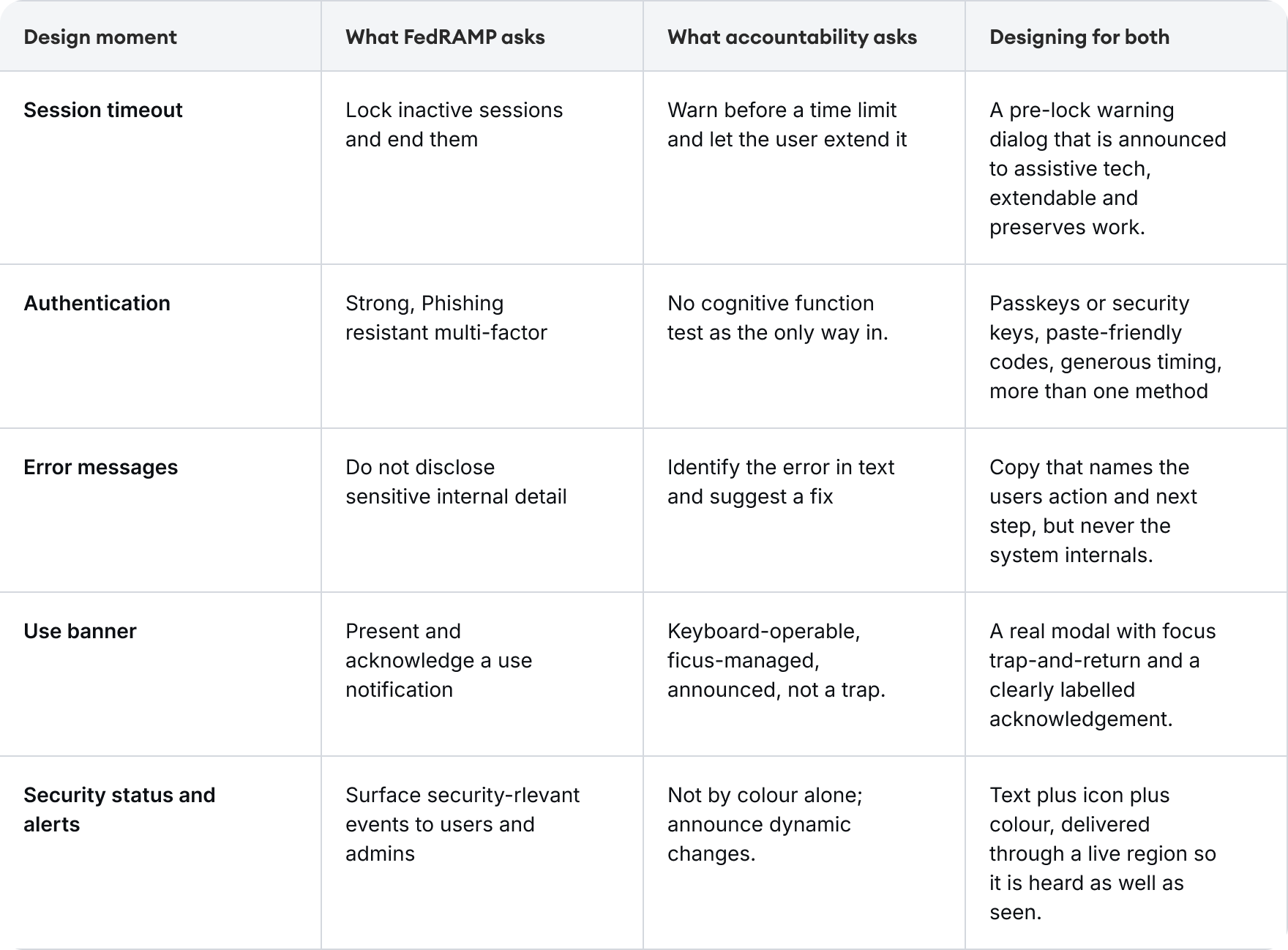
| Design moment | What FedRAMP asks | What accessibility asks | Designing for both |
|---|---|---|---|
| Session timeout | Lock inactive sessions and end them | Warn before a time limit and let the user extend it | A pre-lock warning dialog that is announced to assistive tech, extendable, and preserves work |
| Authentication | Strong, phishing-resistant multi-factor | No cognitive-function test as the only way in | Passkeys or security keys, paste-friendly codes, generous timing, more than one method |
| Error messages | Do not disclose sensitive internal detail | Identify the error in text and suggest a fix | Copy that names the user’s action and next step, but never the system’s internals |
| Use banner | Present and acknowledge a use notification | Keyboard-operable, focus-managed, announced, not a trap | A real modal with focus trap-and-return and a clearly labelled acknowledgment |
| Security status and alerts | Surface security-relevant events to users and admins | Not by colour alone; announce dynamic changes | Text plus icon plus colour, delivered through a live region so it is heard as well as seen |
The pattern in the right-hand column is always the same: meet the stricter of the two requirements and you have usually satisfied both. Security that ignores accessibility does not remove the barrier; it just moves it onto the people least able to get past it.
A working checklist for federal-facing design
When a feature is heading for a federal-facing product, run it through this before the first build.
- Flag the feature early. Does it touch identity, sessions, permissions, audit, or sensitive data? If yes, the control areas above are in scope and belong in the first design review, not the security sign-off.
- Design the unhappy paths first. The timeout, the denied action, the failed login, the no-permission wall. These are where both frameworks live, and they are almost always designed last, badly, or not at all.
- Design each shared moment to the stricter bar. For timeouts, errors, and authentication, meeting WCAG 2.2 AA generally satisfies the human-facing side of the FedRAMP control too. Start from the accessibility requirement and the security one tends to follow.
- Write the security copy. Do not inherit it. Banners, timeout warnings, permission explanations, and errors are content design. Left to framework defaults they will be either unhelpful or over-disclosing. Author them deliberately.
- Test every secure interaction with keyboard and screen reader. Not just the happy path. The logout warning, the MFA prompt, and the error state each need to be operated without a mouse and announced correctly.
- Record the decision once, use it twice. Note which control and which success criterion each moment satisfies. The same record feeds the FedRAMP certification package and our own accessibility statement.
Why this is our advantage
Because we already design to WCAG 2.2 AA by default, we approach these federal features from the harder-to-reach side. A team that has already designed an accessible timeout warning, an accessible authentication flow, and clear, safe error copy has done most of the human-facing work these FedRAMP controls ask for. The instinct is the same one this whole practice runs on: design once, to the stricter bar, and let one piece of good work clear two gates.
For the standards this sits alongside, see the global standards reference, and for how we evidence conformance, see our accessibility statement.